

ODE (from Ancient Greek: ᾠδή ōdḗ) is a type of lyrical stanza and a brand new range of Greek, premium food products. In Greece, odes were originally poetic pieces performed with musical accompaniment.


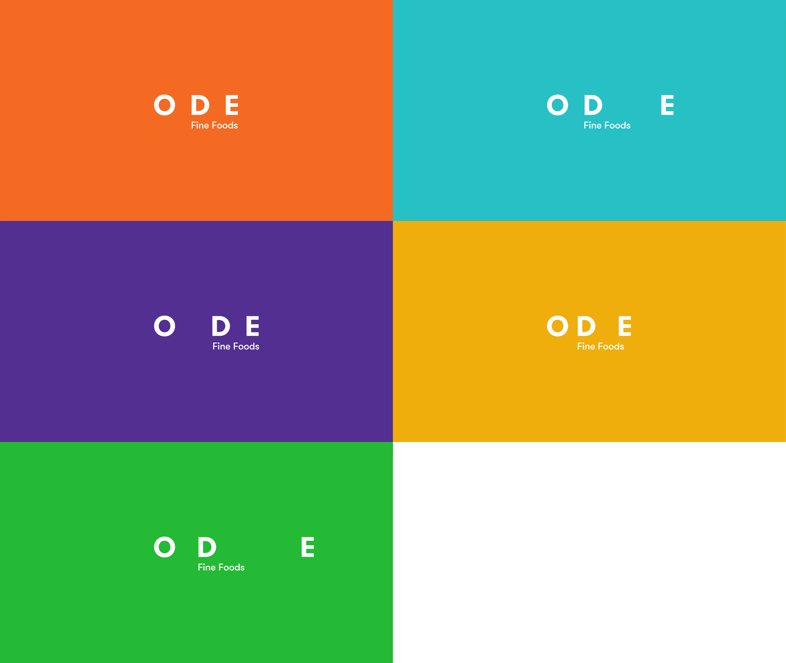
The logotype for the ODE range of Greek food products was designed with a constant change in the letter-spacing as the different periods we find in poetry or the measures of a song.


Randomly added recipes in the honey packages, calling out for flavorful combinations.

Limited edition extra virgin Greek olive oil infused with 24K edible gold flakes, produced in an annual edition of 333 pieces for an equal number of exclusive owners.


For the ODE packaging identity, we let poetry inspire us to create a great range of products and to literally treat them like works of art. Since many may never realize how important a frame is to the enjoyment of a work of art, the ODE Premium range was inspired by the one thing that all art has in common: the frame. The containers were painted leaving a “see through” window that enhances and defines the product without overpowering it. Just like a great frame made for a great work of art.


For the Premium Mass range, we opted for an earthier feel, taking inspiration from the art in nature and the symmetry one finds – a honey comb or a line of trees in a field – and depicting it through abstract illustrations and the colors of ripe fruit.


What we did:
Naming, Brand Story, Brand Identity System, Packaging, Communication Material

Creative & Art Direction: Alexandros Gavrilakis, Copy: Olympia Aivazi,
Brochure photos: Giorgos Vitsaropoulos
–––––
See more: AG Design's projects on Packaging


